
The world of graphic design is vast, with endless possibilities to create and innovate, which can make decision-making much more difficult.
Picking fonts is a good example of this, as it can often be an overwhelming task, given the sheer number of choices and combinations that can be created, before considering emotion and perception.
However, choosing the right font is a vital component of communicating through design.
With our how-to guide, we will break down the universe that is fonts, stripping it back to make it much more digestible and make your selection that bit easier.
Fonts vs. Typefaces
The best approach when looking at understanding and subsequently choosing fonts is to take it back to basics, starting with the difference between fonts and typefaces.
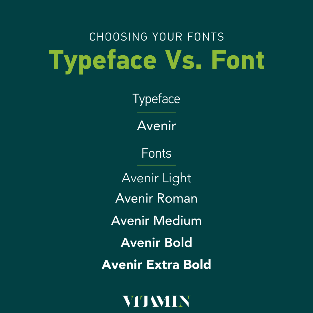
Typeface – a collection of fonts
Fonts– specific style or weight within the typeface group
Example:
Typography Explained
Following on from learning about typefaces and fonts, the next piece of the puzzle involves understanding typography.
Typography – how you choose to arrange type (letters, text etc.)
Typography will allow you some freedom to create a feeling or mood with your type to communicate a specific message to your audience based on how you place your letters and text within designs.
Type Explained
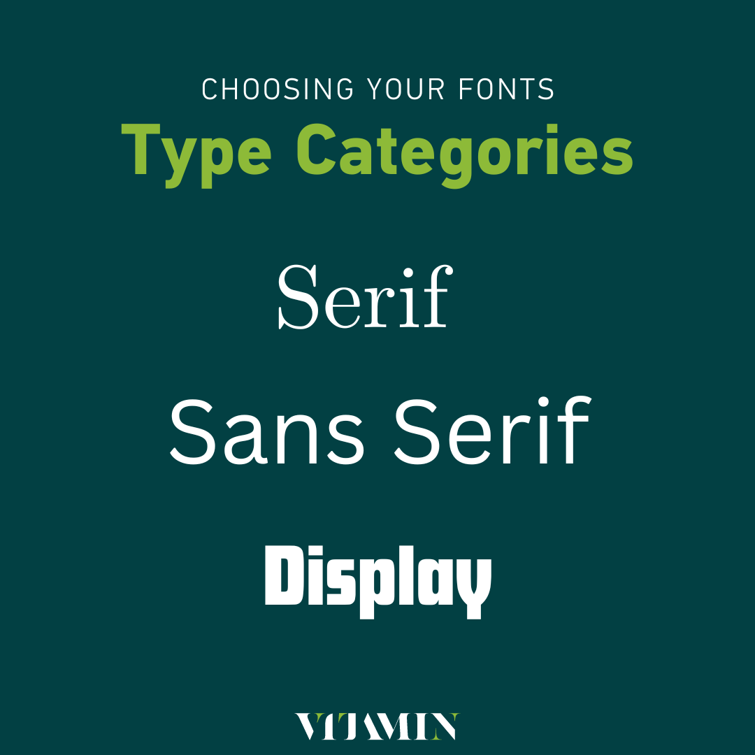
After typography comes type itself, which can be divided into three main categories:
- Serif
- Sans Serif
- Display
Serif
Serif as a font is depicted by the addition of “feet” or little strokes added to letters.
A great example of a serif font would be Times New Roman – where you will notice the additional strokes added to letters within the font.
Typically, serif fonts are used on traditional forms of media or official publications with the formal and elegant style the font portrays.
Sans Serif
Sans serif particularly refers to the serif font, minus the serif.
A sans serif font typically appears more modern and fresh, with a more punchy look.
Some examples of Sans Serif fonts include:
- Roboto
- Open Sans
- Poppins
- Univers
Display
Your use of display fonts should be kept to a minimum and if you do choose to use display fonts, keep in mind that you only want to utilise them in titles and subtitles and not in paragraphs or bodies of text.
Display fonts are great for communicating personality and style for your brand, it just takes some additional thought and strategy if you want to make use of them.
Examples of Display fonts can include:
- DM Serif Display
- Futura Display
- Tan Nimbus
Making Your Selection and Combination
1. Start Simple – Choose Your Primary Font
The best first step is to choose the font that is going to be your headline and subtitle font – i.e. the one that stands out, is eye-catching and grabs attention.
This will set you up nicely to move towards choosing the right body font, giving you the perfect pairing for your brand.
Whether you choose a serif, sans serif or display font, be sure that the look and feel of the font you choose aligns with your brand and that it is representative of your goals and mission.
2. Contrast and Compliment
Choosing your primary font will make the process of choosing body text easier as it will create some structure and guidance on what the font of the secondary text should look like.
A top tip here would be to focus on the two C’s
- Contrasting
- Complimenting
The last thing you want is there to be little to no difference between your primary and secondary text because
- Your text will look the same with no hierarchy
- It won’t appear attractive or eye-catching to your audience
- It can get boring
Word of warning here – don’t go too crazy!
While you can play around here with the options available to you to strike the right amount of contrast, you need to look at it objectively and ensure that it complements the primary text.
Otherwise, you run the risk of going in the complete opposite direction and making your text hard to read, too overwhelming and completely jarring for your audience.
3. Opposites Attract 
Remember how we detailed the types of fonts above (Serif, Sans Serif and Display).
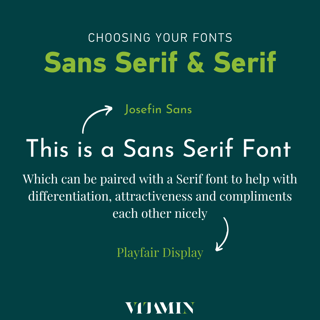
When choosing your pair of fonts, one design option to consider to make the font selection process easier is to pair opposites.
Often, pairing a Sans Serif and a Serif font together provides just enough differentiation between primary text (titles, headlines, subtitles) and secondary text (bodies of text/paragraphs) whilst also being attractive and complimentary.
4. Explore Typeface Combinations
As we mentioned, within a typeface lies fonts with several variations – bold, italic, etc.
In addition to those, you can also find typefaces that vary in width, for example, a condensed font.
Similar to our point on opposites attracting, opposite font widths can be a great pairing for creating differentiation and contrast.
Again, this approach can be aesthetic to look at and easy to read, making you and your brand much more likeable and accessible to your audience.
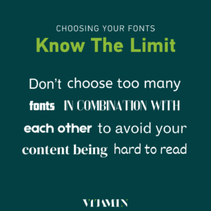
5. Less is Always More
Choosing fonts can be a fun project because you get to play around with the design until your heart is content.
And while this remains true, we highly recommend that you create combinations with a max of 3 fonts that complement each other.
As creative and freeing as design is, a blend of too many fonts can evoke a feeling of lack of credibility, and professionalism while also being irritating to readers.
6. Classics are Classics for a Reason
Jumping on trends is something that the world is very good at, especially in this age of social media, bringing trends to you quicker than quickly.
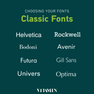
Font design is no different.
Design is a limitless field full of possibilities, meaning new fonts can always be invented.
While it is great to see design pushing the boundaries, it’s important to remember that the classic fonts we know today are classic for a reason.
Choosing a trendy font may seem like the right thing to do but in reality, trends fade away over time, and your brand could be stuck with a time-bound font that people may not like in a few years.
Whereas, your classic fonts have stood the test of time and can prove they are guaranteed to work for you.
In a roundabout way, the oldest fonts are the most widely used and modern.
We hope this how-to guide can help you choose the best fonts for you and your brand.
Why not see our other articles for more web development, graphic design, and digital marketing insights?
Do you need help with your branding? Contact us today to get your project started.